The musings and offerings of a burgeoning greetings master

Monday, June 5, 2017

Mr Cardmaker Stretches One More Time

No, no yoga here. Not for some time. Hey, that's a good idea, though, I like yoga. YOGA!

Oh. Sorry. CARDS! We are here for CARDS. Yes...

So, for the past couple of weeks, I have been sharing some projects I made by stretching my stash and using Christmas stamps to make birthday cards.  You can see them HERE and HERE.

This week is the final (for now) project I have using this idea, and this time I went for more of a July birthday idea.

I made this--


I realize that this gal is in WAY too much clothing for July, so maybe I'm wrong about that idea. Maybe.
I like the stars and reds and blues, anyway. Just go with me, here, if you would...

ANYWAY-
I paper pieced aaalllll of that clothing. And let me tell you, in hindsight, there is definitely a right way and a wrong way to paper piece. Guess which one I chose...

So, this is really not the easiest image to paper piece in the BEST of practices- the tights that peek through the shoes, the straps on the dress, etc... No so easy. Oh, AND I also did the gifts. DO you SEE how tiny the ribbon is on the top gift?

Yeah, imagine me trying to cut, FIND, and glue down all these teeny tiny pieces. I am an idiot on some days. I did manage, somehow, to get it done. My vision and my nerves are recovering nicely;
thanks for asking...

My favorite thing here, though, is the way I separated the sentiment on the banner strip so the girl could slide in without blocking anything.
I also love the background, made with Lil'Inker Designs pierced stitching dies. I combined two sets of dies to get this done, and I love the result.


You can just see how I did the inside, carrying on with the red nd stitched ideas. I think this is a happy card, and all in all, worth the craziness I gave myself with the paper piecing.

I hope you got some inspiration for stretching your stash.
A new idea next week!

Thanks so much for stopping by!
All Best--
Richard

#MFTstamps
#lilinkerdesigns

Monday, May 29, 2017

Mr Cardmaker Stretches Again

I'm continuing with an idea I shared last week on THIS post, using what was sold as a Christmas stamp set in a different way.

Well, I have another version of that idea today.
I made this--

Okay, to be 100%, this was one of the images I colored at Christmas, but it got stuck into my watercolor pad, and given up as lost. I was happy to find her, and I did this birthday card with her.
She's colored with Zig Clean Color Watercolor markers, and I added highlights with a white gel pen.

I stamped this balloon background right on my card base in colors that sort of related to her outfit without matching exactly. As I explained last week, I want the image to merely relate to the background, rather than getting lost in what I call "visual wash." Yes, I DO make up words..

I die cut the birthday word from some glitter cardstock (which actually is from a Christmas stack, btw). I white heat embossed the "it's your" on a hot pink cardstock scrap, and then dry embossed that for some texture. I like that the strip sort of gives her something to stand on, as well.
I added enamel dots to tie in all the colors (because that pool color wanted HELP), and that was that.

Stay tuned! I have one more in this idea, which looks TOTALLY different. I'll tease you by saying July birthday people will love this one, especially...

Thanks so much for stopping by!
Remember to stop by and see me on Instagram @Rlbreaks!
All Best-
Richard

#MFTstamps

Monday, May 22, 2017

Mr Cardmaker is Stretchy

You know, I actually make Christmas cards all year long, with the obvious exception of JANUARY, which is my "Lort, I am BURNT out, I'll never have a good card idea again" month. Nope, no Christmas cards then. Rarely ANY cards, now that I think about it...

Well, I was going through my Christmas stamps, and I came across one of my favorites.
As I'm looking at it, I'm thinking, well, why does this HAVE to be for Christmas?
So, I decided it didn't, and I made a card.

We're stretching our stamps!

I made this--

So, yeah, little girl with a stack of presents. Great for the holidays, sure, but who says this can't be for birthdays, too? Not this cardmaker, that's for sure...

This is a My Favorite Things Pure Innocence stamp, colored with copics, with some white gel pen highlights. Uh, some of those lines could be a tad bit straighter on that purple gift, I think. Maybe less coffee while crafting...Yeah, RIGHT!! Get used to wavy lines, folks...
My favorite part is adding the patterns to the clothes. Freehand, folks. Love that!!


Oh, and the background is done with my new Lil' Inkers Quilted Stitched Spiral die. Don't you LOVE that? Lil' Inkers is just down the road from me in Dedham, MA, and they do CUTE stuff!

I love that floral paper, and I finally gave it up from my hoard. I purposely went with a paper that SORT of went with my image, but I wasn't looking for a perfect match. I think it makes your eye move around, rather than just getting a visual wash, so-to-speak. (I make up words, you know...)

Now, who'd look at this and insist it was a Christmas stamp?


Stay tuned; I did a few cards with this idea, all different, and I promise you'll dig them ALL.

Thanks so much for stopping by!
All Best--
Richard

#MFTstamps
#lilinkerdesigns

Monday, May 15, 2017

Mr Cardmaker has Cups to Go

More Concord & 9th stamps! I really love so much of what they do at Concord & 9th. They just seem very considered and innovative about what they put out, and they seem to stay away from some of the trendy stuff.

I bought the "Let's Chat" stamps, and really love them. I like the bold, yet loose style, and the sentiments are nice. And, of course, it's about coffee. 'Nuff said.

I made several cards, but because they're pretty similar and were SO quick and easy, I'm showing you all of them today.

I made this--

So, because these images are so wonderful, I hated to do too much with them.
Here, the only embellishment is the little bit of glitter in the spoon, because...well, because shiny!
This is on lighter weight cardstock, so I will use this for a quick hello, as opposed to something special.


Next, I made this--


So, iteration #2. More color, more stamping...whatever. I added the foam image with white embossing this time.
I think I went a bit crazy with the pinks here. No worries; I have pink lovers in my life.

Next, I made two of these, thanks to my MISTI stamping tool--


One of these days I will learn to do sentiments in more than one color, I swear. I do like that the color changes are mostly in line images with no coloring, so you have to look at it for a second to grasp what's happening. The bold heart and very strong brown of the coffee make me happy. More glitter in the sugar spoon, for the aforementioned shiny.
These, too, are on a 80# cardstock. They're also four-bar sized. (I had the envelopes hanging around)

So, these were fast and fun, and great to grab when I just want to quickly send out some happy mail.

Speaking of, I've been SO GOOD at that lately!
I have managed to get two or more random happy mail cards out every week for a while now.
OMG- If you are having a cruddy day, digging out a few cards and sending them is a GREAT way to get yourself into a much better mood! I can't recommend it enough.

In fact, I'm going to do that now. These cards are outta here! Can't buy more joy for the price of a stamp, I'm telling you.

Thanks so much for stopping by!
All Best-
Richard

Monday, May 8, 2017

Mr Cardmaker is a Hugger

So, I have to admit, I am not the first guy to jump on the bandwagon when it comes to buying the latest and greatest products out there. I like to look, make sure it's not a flash in the pan, that sort of thing. I add things to wish lists all the time, and I'm GREAT at filling a shopping cart and then clicking out at the last possible second. I'm probably the sole reason why those emails from companies saying, "you left stuff in your cart" were invented. My apologies. Really.

I do buy stuff, and plenty of it, though I notice there are plenty of folks out there who really do buy EVERYTHING. ALL OF IT.
I am glad I restrain myself, though. I think there were a few fads that came and went and I was glad I missed.

I am limping along, picking up some faves here and there, and I bought the Concord & 9th Hugs stamp set. I passed on the dies for now, but the wish list abides.

I did cards with the bear image from this set a while back--you can see them HERE.
This time I went for the citrus slices, to see what could be done with them.

I made this--

This was actually my very first attempt to use copics with this set, and I definitely have some practice to do with them. The white panel was actually a full panel originally, but I tried to make some grapefruit slices and BOMBED with them. It seems I haven't got the right pink markers...
Happily, I was able to trim those off, and it left me with this panel.

(Wow, I am looking at that coloring; how embarrassing.)

Anyway, I used versamark ink to stamp the slices on the card base, which is made from Stampin Up Summer Starfruit cardstock. Discontinued. So sad. I love that color.
Once I made sure it was TOTALLY dry, I stamped all the "Hugs" and "More Hugs" and white heat embossed them. Do check to see that one step is dry before moving on, otherwise you'll have a big mess, which really is not so much fun.
I added the yellow striped paper along the side of my panel for some energy and separation, and added the enamel dots to finish.

I thought it would be fun to do the inside, too, because there was a sentiment in the set that was so perfect for it.
I did this inside--

I love the little splash image. Perfect.

A simple card, really, not too bad for a first go with these stamps. I hope you found some inspiration!

More next week!
Thanks so much for stopping by!
All Best-
Richard

#concordand9th

Monday, April 24, 2017

Mr Cardmaker is Resistant (and Has Been Exercising!)

Emboss/resist is one of my favorite techniques, not only because it looks fantastic and takes very little time to get a great effect, but also because you can do it over and over and get different results just about every time.

For example, I made this--

Fun and happy, quick and easy. My way to go!
I used Concord&9th's Eat Cake an Celebrate stamp set on watercolor paper with versamark ink, and heat embossed white embossing powder over it.
Then, it was just a matter of three colors of Distress Ink in washes over the images, and I was almost done!


I did go back in with my waterbrush and paint in some of the tiny details on the candles, and, of course the flames.
Then the only thing to add was my diecut sentiment and some enamel dots. Couldn't be easier.

I also decided to play around with the stamps and matching dies a little more, and while this is in no way ready for sending, I can't help but feel there's a good idea percolating, and I'm willing to play around until it bubbles, to the surface.

I made this--

The candles here are coated in a heavy dose of Spectrum Noir clear sparkle pen. These yellow star sequins really help the overall look, but I'm just not sure about all of that negative space. I'm still pondering about it...

Standing up--

As you can see, the sentiment is diecut, so you can look through to read part of what's inside.

That looks like this--

I stamped the cake image in Versamark, just to get a subtle impression. I'm pondering about that decision, as well. And the spacing of the sentiment...and so much more...
An exercise, I call it. I'll be working on it...

Thanks so much for stopping by!
Remember to stop by on Instagram @rlbreaks !
All best-
Richard

Monday, April 17, 2017

Mr Cardmaker Prefers a Chocolate Cake Card

Building the birthday stash again, and using some of my newest acquisitions. Eat Cake ad Celebrate is a fun stamp and die (sold separately) set from Concord&9th, and I have had some fun playing with it.

I made this--

I played with some white embossing powder here, going to town on my background. To give my chocolate cardstock some extra depth, I sponged an even darker ink on bottom half and the edges. I do love me some emboss/resist action.
I kept the image are on the simple and petite side. That cake stamp makes me so happy, and there's a world of variety to be had as far as coloring the thing. I also love that the Happy Birthday sentiment has a die of its very own, too!


I had the gold zigzag circle on my work table, gathering dust, so I was happy to be able to use it with my stitched diecut vellum circle. I slid my adhesive for the vellum under my diecuts, and also under my sequins. A god thread nest (to amplify the gold) and some stickles in the sequin centers, and I was all set!

I do seem to have a bit of a messy background with the loose bits of white embossing showing here and there, but I'm going with calling it a little on the "urban side."
That's my story, and I'm sticking with it.

Thanks so much for stopping by!
Remember, you can catch more (including some "in process") photos on Instagram @rlbreaks !
All Best--
Richard

Monday, April 10, 2017

Mr Cardmaker Walks on the Dead Side

I actually don't watch The Walking Dead. There, I've said it. I have enough crap to give me nightmares, believe me. I do, however, have lots of friends who DO watch it, so when I got this idea to use my Avery Elle Hats Off stamps in this way, I went for it.

I made this--

This actually combines a few sets of stamps. Because they're my stamps, and I'll do what I like with them, that's why. The cake comes from Eat Cake and Celebrate by Concord&9th, and the letters are a GinaK Designs set called Lots of Letters by my friend Melanie Meunchinger.
So, yeah! Instead of grasping at brains, my zombies like cake. Because, who doesn't like cake, am I right?
I clear embossed the images and colored them with my varied collection of colored pencils on kraft cardstock. I had a good bit of fun trying to replicate the rotting flesh of zombies here. I don't really get a ton of reference points on that sort of thing...


I love the way the cake and candles turned out. I love making the candle flames "glow."
Well, the rest of the card was simple, a quick designer paper mat and card base, and that's it. No bling or anything needed.
But wait, there's more!

The inside!

I cracked myself up when I did this, I have to admit. Hand-drawing the dismembered end of that arm had me cackling. And the staying connected to the balloon part, of course. I do have a dark sense of humor sometimes, what can I say?
I now wish I had stamped the arm in a soft brown ink, so it would better match the arms on the front, but I think I'm probably being picky at this point. I think the joke works, and that's the important thing, right?
The balloon was stamped with SU Balloon Celebration stamps, but it didn't stamp so well, which I took as an opportunity to use as a shading exercise with more colored pencils. Save! The string ws drawn by my own hand. (brave on my part, I must say.)

Thanks so much for stopping by-
Come see me on Instagram @rlbreaks
All Best-
Richard

Monday, April 3, 2017

Mr Cardmaker is Iterative

I can't tell you how many projects I finish (and mostly like) where I look at them and think, "next time I would ...". Of course, I rarely make the same thing twice, so whether or not that actually happens is another thing. It's the way my brain works...whatever.

Well, I have a new-to-me stamp set from Concord & 9th called Hugs, and it has the sweetest bear stamp. I wanted to use it for a card for Charlie for our 3rd wedding anniversary (together almost 26 years, don'tcha know), and so I dove right in.

Somehow, getting the bear colored proved to be more of a challenge than I ever thought it would be. It took me THREE times to get there, and I still think there's work to be done. I did a good bit of work though, and I hate trashing things that somebody, somewhere will appreciate.

ANYWAY-
This is the final card--

I tried to mimic the lettering style of the word hugs on my envelope. Not too shabby, if I do say so.

I actually did an unacceptable job on the bear on this panel, so I did the bear again on a scrap, colored him with copic markers, and then fussy cut him out with no border. I took a Memento Tuxedo Black marker to the edges in order to hide the white edges, and then paper pieced him over the not-so-great version.
I am digging the papers, and the Distress Ink blending worked out nicely.

Previous to this, I made this one--


So, this guy was done on watercolor paper and colored with my Zig Clean Color Real Brush Watercolor Markers and a waterbrush. I made I real mess here; I hate the marks that are left from my repeated attempts to get the shading right. Yeah, that really didn't happen, either.
HOWEVER, it does look passable for somebody who'll just be happy to get a card from me, so into the stash it goes. I do love my ancient green gingham paper here...

Lesson learned. Keep trying. It will probably NOT get worse the more you try, but you have to be pretty bad at something before you become pretty good at it, I'm thinking.

And, Charlie loved it. 'Nuff said. ANd, somebody, somewhere will like this one--


Thanks so much for stopping by!
Remember, I'm on Instagram @rlbreaks
Stop by and see me!
All Best--
Richard

Friday, March 31, 2017

Mr Cardmaker is in Orbit with 12 Kits of Occasions

Well, I am going to try to avoid space-y puns for this WHOOOOOOOLE post. We'll see how that goes...(Titles don't count, right?)

I am so happy to share the cards that I designed with the BEAUTIFUL kit that Jeanne Jachna created for 12 Kits of Occasions. March is sort of a weird month to do a kit for, especially when Easter is in April this year. St. Patrick's day comes and goes so quickly, so you're left with....SPACE! I love it!

Anyway, I just loved all the stamped images and die cuts, the papers and embellishments. Jeanne really leaves you wanting for nothing with her kits!

I made five cards with this kit, and I kept every little thing that was left over for a DEFINITE return for more.

So, on with the cards!
I made this--

These rockets are so awesome. Clean, tight, totally representative of everything that says ROCKET. Love the flames. Aren't the swirls in the background cool? That Jeanne. She finds the best stuff for us...
I love that this makes a great masculine card. I think adding stripes into the design helps to strengthen that idea, but there's no reason a woman wouldn't dig it, too.

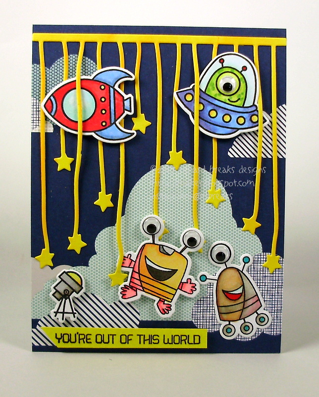
Next, I came up with this--

GOOGLY EYES!!!!  These aliens cracked me up, especially once the eyes got attached! Coloring them with my copics was really fun, because there's really no way to pick a wrong color.
I went for a sort of theatrical feel with this card, thinking of the stars die cut as a curtain. Some serious flying skills are happening there with those space ships; they manage to maneuver that thing with ease.

Next, more space ships--

This one started with the blue diecut panel. I went crazy trying to figure out how to break up the navy. I knew I didn't want to stamp on it, because I didn't want to compete with the stars. I finally decided to break out my scoring board and add some score lines. This worked out perfectly for me-The stars are in a strong linear formation, so more lines just add to the strength. The super stylized space ships are a great foil to all the lines, and the two circles help balance things.
The brightly colored space ships really pop off the dark navy, too.
Uh, note the sneaky googly eye...

This next one--

We're a bit closer to home here, but I just LOVE the way this worked out. I love Seattle's Space Needle, and when I saw these super billowy cloud diecuts, I was INSPIRED! The yellow paper was actually the reverse of a more space-y theme, but it was just so strong, I had to use it.
I was a bit nervous doing such a simple card, which is why I went for the stars, and I'm really glad I did.
You'll notice that I didn't reach for any bling on my cards, and all shine comes from the papers themselves, or my Spectrum Noir shimmer pen, which doesn't really show up in photos.

My final card--

There were quite a few space themed stamp sets released this year, and IMHO this is the BEST.
My Favorite Things came out with these CUTE kids in spacesuits, with some really sharp vehicles and planets. I just love this set.
The upside-down guy is on an action wobble! This thing is wonderful! It makes him shake around, yet it compresses down super flat, so postage is easy!
I do believe it's time to break down and invest in those skin toned copic markers. I'm going to have to go back and dig out my gamsol to make my face coloring work just a bit better. Hey, and how about some glossy accents over them? They're wearing face shields, right? 
I clearly have some work to do.

So, I now have five cards that can easily be sent to either a man or a woman of almost any age.

This kit was a blast to play with. (rats, I was so close. Missed it by THAT much...PUNS!!!)
Seriously, though, Jeanne supplied SO much to spark a ton of creative energy. I was able to just lay everything out on my work surface, move things around a bit, and GO!
The only (ONLY!) downside to these kits is the fact that now I have to go BUY so many of these things I was so happy to play with. Cry, beloved wallet!

PLEASE go and see all the wonderful creations linked up at the 12 Kits of Occasions blog. Worlds to see! (argh!) Go! Take off! (oh, come on...)

PUNS!!! (insert shaking fist here.)

Thanks so much for stopping by!
All Best-
Richard